Wednesday, October 10, 2007

Project#3--Photoshop Editing Exploration--Digital Imaging

These images were more of a practice in different photoshop techniques than making a very in depth meaningful work of art. My ideas and sketches i felt really showed in the final images so I would say they turned out really well.

Project # 2-- Narrative--Digital Imaging

These images were done in Corel Painter and I was trying to display different emotions through narrative scenes. The challenge was trying to tell the story without really wanting to portray figures or beings within the picture.
Anger


Depression


Fear


Insignificance


Tranquility

Thursday, September 6, 2007

Wednesday, September 5, 2007

Digital Imaging Project 1


Our Project images did not havea real theme among them all. Although, when we were tryinto decide on ideas for each painting, we found landscapes and still lifes that one would paint normally in reality, to be among the most satisfying pieces to look at when completed. In our ocean image, we each contributed to the collaboration piece by painting our own bits of coral, and adding in different effects to the image. The exquisite corpse number one of the landscape came out rather well for how random this technique can turn out. Then our second corpse we did a figure. This one ended up a bit on the random side but i think the effect really works from the final image. Our final group image was a still life of fruit in which we came up with the idea to each present our own specific tool to the image and once the 4 tools were combined on the page, the image would be complete. My personal image that i completed was a more simple design. I tried to go for a sumi ink drawing work with japanese styling of placing a tree and figure in the foreground with more images throughout the middle ground and background.

Tuesday, August 28, 2007

ArtC311--Op Art


Victor Vasarely's Op art was very unique and how it began something new in the art world. The optical illusion was interesting and mezmerizing and i think that's why many people became drawn to it. I really enjoyed the work with the outdoor installation because of it's multiple colors and very interesting illusion of 3- dimensional boxes. The zebras he did were some of the first illusionary works but they are still some of the more interesting ones i believe.

Wednesday, April 4, 2007

Blog about Renee Byerly's Portfolio

I decided to have a look at some of the grad students' portfolios at BG and Renee's really interested me more than most of the others. Her portfolio at first glance is not overwhelming, yet still visually interesting. When you look at the home page, it appears very simple and laid out so that the user can easily maneuver through the site. Navigation-wise, her site is simple to use, containing a main bar with all her different works on it taht scrolls while you can easily select which portion of the scrolling pictuures you would like to look at simply by clicking on each specific link directly below the scroller. This user-friendly interface is how i percieve a good website. Without the user being able to navigate throughout your portfolio website easily and with enjoyment, it oes not matter how good your art is, your portfolio will say everything.
Her color themes come off as dark, with blacks, maroons and greys, which gives the site a sense of rich, deep tones or moods. This may or may not be the type of mood she was going for but i do think a lot of her works represented the same sort of tones to them, so over all i believe her color themes played out well into the scheme of the whole site.
I found her designe elements such as the lines taht follow your cursor around andthe way she had her art presented with a sliding transition gave the site a very sleek, brisk sense which helped quicken the sites navigation.
Overall, i believe this portfolio was very successful and the only thing i really did not enjoy about it was nothing. It had a very professional look, design and theme to it, and was easily navigated and I hope to create a portfolio that can be just as good as hers.

http://digitalarts.bgsu.edu/portfolios/reneenb/
Journey


Metallic Entity


Heroic Entity


Foundation


Elementals One


Elementals Two


Dreams

Wednesday, March 14, 2007

Sculpture Artists


The first sculptor I chose was Alexander Archipenko. His sculptures I found very interesting because of his portrayals of the human figure. The simple shapes connect together and form these compositions that convey an amost otheworldly figure, yet still humanistic.


The second artist i chose was Nancy Holt because her sculpture work dealt with such an interesting topic of celestial art. Her Sun tunnels had such a different syle to her original idea that I could not possibly pass up putting her in my blog.


Thirdly, i really enjoyed Robert Smithson's works because his sculptures consisted of many geometrical designs, along with some natural works involving the dirt and such. Both of the different ideas had dramatic effects just through a simple galnce at them and his ability to give the works such power is commendable.


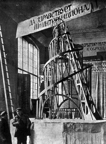
My fourth choice just so happened to be THE Tatlin who had been devising the Tatlin tower, which woul dhave dwarfed the Eiffel tower of Paris. I thought this was seriously amazing at the proportions of the tower and even the model shown was really interesting to look at. His idea of giving it moving parts coinciding with the days montshs and years was unique. His other smaller works had a very unique quality to them as well in how he seemed to compose many of his works with some sort of architectural reference to them. I thought this gave the pieces something different to think about than most sculptures.


Walter DeMaria, the fifth sculptor i chose had the craziest ideas putting the metal rods all lined up in the field to attract lightning and make one of nature's most powerful phenomena into a work of art. This truly astounded me and i would love to go see the Lightning Field. His other works had very different styles as well in how he would assemble massive structures, or works taht would span a whole room. These works had interesting inspiration from the earth as well, but the scale gave them their true potential.


Monday, February 12, 2007

My Video Identity

My concept for my video is going to be more of a literal one like a reality show more or less. It will involve me going through actions in my day, mainly driving in my car and me talking. I want the basis of the movie to show my identity through use of reality and how I go about my life along with how I act towards people. I think that with this type of video you can really show how a person really is by just their actions and what they say and think.
The camera will be recording me from the passenger seat to put the viewer into perspective that they are actually there in the car along with me occasionally making eye contact with the camera to include the viewer directly. In addition there will be a few other shot angles in the car such as an exterior shot with panning and close-ups of my face. I am hoping to include some dialogue while there is a close-up of my face to insinuate my thought process in action. I want the audience to really feel like they'e driving in my car with me on the way to whereever I am driving, most likely some place of significance to my identity, but also with a random sort of intent such as running errands. In addition, with the shots of me thinking, this will give the viewer not only a personal relationship feeling, but also an omnicient sort of observation into my identity. This driving will Most of the audio will involve conversational dialogue along with some music possiby.

Tuesday, February 6, 2007

"Video Art", pp. 78-113 by Michael Rush from New Media in Late 20th Century Art

1) Name an Early artist mentioned in the article for CONCEPTUAL WORK performing in front of the camera. Describe a work. (2 points)
A conceptualist name who worked with video and performed in front of the camera was Vito Acconci who did "Theme Song" a work where he is directly in front of the camera trying to coax the viewer into joining him inthe camera.

2) Name an artist mentioned who deals with PERSONAL NARRATIVE. Describe a work. (2 points)
Bill Viola is a widely known artist mainly for one of his works entitle "I Do Not Know What It Is I Am Like"in which he exppress the fundementals of self and non-self by being viewed as a reflection in an owl's eye.

3) Describe the piece you were most interested in viewing after reading this article. Look the work up on the links, and expand on Rush's comments. (2 points)
I thought that Peter Campus' "Three Transitions" piece was very interesting and how he dealt with identity and image. His ideas he came up with are so sureal sounding they just blow my mind and how he uses such amazing illusionistic qualities

4) What do you better understand now about Video Art? (2 points)
Video art is something taht can be so simple yet the meaning can be so complex, and can make you sit there for hours just contemplating the context behind it. I think that for a video to be art, it must have an idea behind it, not necessarily a motive, but just an idea or thought behind it of the artist's that reflects their identity or their thoughts.

5) Based on Rush and this article, what makes Video Art vs. an "artful video"? (2 points)
Video art like i said before involves this idea that the artist is conveying something to the viewer with a specific idea or way of filming the scene, while an artful video may just be a video with some nice music in the background and talk about creativity and ideas.

Wednesday, January 17, 2007

Tuesday, January 9, 2007

Chuck Close


Chuck Close is a very patient fellow. His works are mainly portraits but compositionaly I do not find them uninteresting like a normal portrait may turn out. These works are made up of individual images put together to make a whole and the process takes him unbelievably long. This shows identity within the paintings and images as clear as day.

Robert Longo


Robert Longo uses a very common subject matter, the figure. But then he takes this figure and instead of traditionally focusing in on that, he moves towards the idea of space, and motion. The figures positive and nagative space it creates in the different pieces are what give each image it's distinct quality that tells people, "this is a Longo." I find that his identity shows in his work very distinctly in that he views people as a constantly moving force. The wave piece he did goes along with this idea perfectly.